Sunday, June 20, 2010

Comic Book Review: Brightest Day #4


Book Information

Written by Geoff Johns, Peter J. Tomasi
Penciled by Ardian Syaf, Scott Clark, Oclair Albert
Colored by Aspen MLT's Peter Steigerwald
Cover by David Finch, Scott Williams

My Awe-Inspiring Opinion
Black Lantern Firestorm is at the center of attention in this issue! Or so the cover would have you think. Again Brightest Day brings a cover that resembles nadda of what is actually contain within as far as the story is concerned. That's not to say the cover art isn't an explosion of talent from Mr. Finch, Williams, and Steigerwald, but I'm not a big fan of being misled. False advertising is a no no in my book.

Other than that, Blackest Night #4 is a lot of fun. The overall scheme takes a different turn, or at least maximizes on developing the story for certain characters and leaving the others out. I had closed the issue and my first question was, “I wonder what happened to Martian Manhunter?” That was an intelligent move on Johns and Tomasi's part since this whole arc is so tightly compact that divulging into each character's story EVERY two weeks would be overbearing and would wear out the readers. If Tim Burton has taught us anything, it's that too many plot lines make for bad stories!

I am enjoying having Hawk and Dove apart of this arc, Hawk in particular. I didn't grow up with Hawk in my corner so I have a great opportunity to learn more about this Modern age predecessor. I would love to see Hawk and Hawkman go head to head and see who the tougher and more testosterone driven one is. Most people would probably vote for Hawkman because Hawk's outfit could be worn by an Olympic ice skater, but that was a choice made back in the day and the artists are simply continuing the attire from then.

Speaking of art (very corny transition, I know) I must say Ivan Reis and company give us a quality display of visuals huh? The different artist toggle throughout the book doesn't deter me in the least, which is a HUGE thing with me, but they pull it off quite nicely. And I think I'm going to put Dove in the “top ten hottest DC women” list! Thank you Ivan Reis, you rock!

My Profoundly Climactic Conclusion
Fun and worth the $2.99 price mark. This wont go down in history as one of DC's greatest issues, but it's fun all the same.

Ratings
Writing: 9
Themes: 9
Art: 9
Overall: 9

Wednesday, June 16, 2010

Blog Delay....Yet Again

Hey guys, you'll have to bear with me on blog posts.  I'm currently in Kansas City training for my new job until the 23rd of June.  I'll be picking up s few issue's today and review them this weekend, but posts will be coming out slower than usual.

I also plan on seeing Jonah Hex this weekend since there will be no training at all.  I'll have two days to myself to see the movie and read A LOT!  And even though my fellow trainees think that is strange, I will be enjoying it very much. 

Sunday, June 13, 2010

Comic Book Review: Batman #700


Batman created by Bob Kane

Literary and Artistic Credits
Author: Grant Morrison
Pencillers: Tony Daniel, Frank Quietly, Andy Kubert, David Finch
Colorists: Ian Hannin, Alex Sinclair, Tony Avina, Brad Anderson, Richard Friend, Peter Steogerwald
Letterers: Jared K. Fletcher, Janelle Siegel, Mike Marts
Cover: David Finch
Variant Cover: Mike Mignola

My Awe-Inspiring Opinion
It has happened, Batman turns 700 years old! (Or at least that’s what I heard a little kid scream in the comic book shop when I picked this issue up, very cute.) And what better way to celebrate this glorious occasion by hiking the price tag up to the $4.99 mark, spewing almost 25% of the book as unnecessary documentative (is that a word?) Batcave information, and putting the story in the hands of my least favorite writer.  #700 finds itself wandering around the time vortex in the same manner as Hansel and Gretel, aimlessly combing the forest without a real purpose or goal.  Maybe I’m just a simple minded peasant, but when it comes to stories dealing in time travel or some time paradox, you have to be extra careful so nothing becomes confusing or silly, and I’m not sure Morrison was able to accomplish this.

The issue starts off with Bruce Wayne and Dick Grayson and works its way through all the way to Terry McGinnis and a robot-like boy wonder.  Professor Nichols is at the center of this mystery which spans in all three timelines.  We of course discover that it is Nichols himself who goes back in time to murders himself, causing this incredible and vicious cycle to continually rotate throughout time.

I wasn’t sure I understood why Professor Nichols needed to go back in time to kill himself.  So the Joker took away his dignity and embarrassed him as a man of science, ok I get the motivation, some men can’t take a joke right?  But Batman stopped the Joker and the rest of his cohorts, I would have assumed from that event Nichols need for revenge would be quenched.  Along with this tirade of mine, for the life of me I can’t figure out how the three timelines mesh together to help this mystery make sense.  I won’t go into the details, you should pick up the issue to find out, but I felt there were some major problems with tying all three periods together.  There really was no explanation as to why Nichols was 20 years older than he should have been, nor was there any reason about his future self being younger.  The paradox of time in this story is all very confusing to me, and I’m a guy who loves Star Trek, it shouldn’t matter so much!  It’s a very creative idea, and points should be awarded to Morrison for that very fact, but he tried WAY TOO HARD.

There’s no need for me to say it, but I’m going to anyway…the art drove me NUTS!  For those of you who read my blog regularly, I’m sure you know by now that artist toggling aspect of many comics recently is not my favorite thing in the world.  I’ve been known to mark the art down for that, even if every artist is good.  I am faced with this problem in #700, every artist in this book is fantastic.  Who can complain about Andy Kubert right?  But I prefer to have one artist complete an entire book rather than DC divvying up the artistic duties, but everyone did so well.  I understand the reasoning for doing this, but it becomes way too much of a distraction for me within the story.  SO!  Instead marking down the art for making my head explode, I decided to grade each artist by themselves rather than as one cohesive unit.  And it’s #700 right?  It should be held to a higher standard.

My Majestically Climactic Conclusion
I could have done without the whole Batcave section at the end, but I’m sure fans will eat it up. This book is creative in its approach, but it came off more as random incoherent jargon than a well rounded story.  And what’s worse, Morrison will be returning for #701 and on.  I certainly hope the end line “To 700 More” doesn’t speak to Morison’s immortality, because that would just kill me!

Writing: 4
Themes: 6
Art: Tony Daniel – 10
        Frank Quietly – 10
       Andy Kubert – 10
       David Finch – 8
Overall: 8 out of 10

Saturday, June 12, 2010

Comic Book Review: Secret Six #22


Literary and Artistic Credits

Written by Gail Simone
Art by J. Calafiore
Colored by Jason Wright
Lettered by Travis Lanham
Cover by Daniel Luvisi
Editor: Sean Ryan

My Awe-Inspiring Opinion
What a mind fuck!  Seriously, the “Cats in the Cradle” arc has been nothing but perfect.  I can see why Simone’s work on Wonder Women (as of the last three issues) hasn’t particularly been her best work seeing as how much of her effort has been with this story.  This wasn’t a story about the antagonist beating the bad guys or overcoming the odds, this was about a group of people dealing with their inner most conflicts and how they come to terms with them.

The story gives us the finalization of Catman’s past as a young boy growing up with a physically and verbally abusive father whose mind-twisting jargon caused the young Catman to embrace a new way of life, one filled with murder and a stoic, uncaring demeanor.  However, this life changing event doesn’t keep our feline hero from loving those closest to him.  The question raised here is what are you willing to do for loved ones?  What is the best for them?  MacQuarrie brings to light that Catman’s son is very much alive, and adopted by a new family.  Like MacQuarrie said, no one can hurt Catman through his son ever again.  Catman had to make a choice, let his son live a happy life and cause his mother the utmost pain, or go get his son back and wait for the next dubious villain to snatch him away for ransom yet again.  Just like Watchmen, Gail Simone makes you ponder on what you must do when faced with two options, both of which will cause someone a great deal of suffering.  Catman letting go of his son and lying to Cheshire about it could very well be one of the most tragic endings in a comic book I’ve ever read.

The stories stems even further with the Catman’s teammates, mostly dealing with the issue of family.  Black Alice comes to center stage with her amazing bit of oratory, expressing her guilt of theoretically giving her father cancer.  This sense of loss brings Scandal savage closer to the young villain, and even more so with Ragdoll whose defense of Black Alice was an amazing addition to an already depressing story.  (Deadshot really can be an ass huh?  That’s why we like him!) 

I was a bit thrown off by Wallace’s sudden electrifying personality.  It makes sense though in the overall scheme; why were MacQuarrie’s gang of thugs so hard to catch and defeat?  Because they had super powers!  I don’t remember any clues to this fact, but who’s paying attention right?

Calafiore, unsurprisingly, achieves another outstanding artistic finale in #22.  I do miss Nicola Scott, but I’ll take Calafiore any day!  The energy that goes into every panel and character is uniquely his and should be considered as one of THE BEST artists in the industry today.  However, I did find the Stained Glass scene at the end, right before Catman pushes MacQuarrie out of the window, a little hard to look at.  It was very difficult to differentiate the characters bodies from the shadows and colors beaming down on them.  But this could very well have been a purposeful aspect to cause the reader a sense of uneasiness in the moment.  So, no complaints there.

My Majestically Climactic Conclusion
Secret Six is an amazing title and I would recommend it to anyone.  If you are conflicted with paying more money to you’re already long list of monthly titles you pick up, please consider dropping a title or two, this is well worth your money.  There isn’t one issue since this title began that hasn’t been worth the $2.99 price mark and I fully expect anyone whose reads this will come away happy.  Simone doesn’t approach the Six like every other comic book in the industry; it’s new, innovative, and fun.

Writing: 10
Themes: 10
Art: 10
Overall: 10 out of 10
          + 5 incentive points

Friday, June 11, 2010

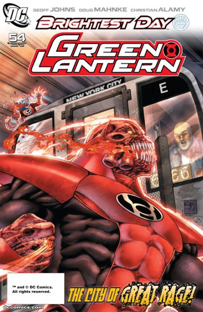
Comic Book Review: Green Lantern #54


Literary and Artistic Credits

Written by Geoff Johns
Penciled by Doug Mahnke
Inked by Christian Alamy, Tom Nguyen, Keith Champagne, & Mahnke
Colored by Randy Mayor
Lettered by Nick J, Napolitano
Cover by Shane Davis, Sandra Hope, Barbara Ciardo
Variant Cover by Alex Garner
Associate Editor: Adam Schlagman
Editor: Eddie Berganza

My Awe-Inspiring Opinion
A lot can be said about this issue as it’s filled with multiple plotlines, resembling the Green Lantern Corps title.  We have Atrocitus taking out an entire subway train full of people, Hal Jordan still attempting to lift that seemingly weighty White Lantern, Sodam Yat being freed of his sunny-side prison, and the learning of the entities names along with our mysterious little man capturing Ion.  I’m actually very surprised that Johns was able to fit it all in 22 pages.  While this comic will never be a climactic issue that will be remembered for years to come, it definitely takes us on a roller coaster ride that is fun and epic.

First let me start off by saying Doug Mahnke is the MAN!  He has such an impressionable style that has only been equaled by Aaron Lopresti, Ed Benes, and Frank Quietly.  The use of light, depth perception, and attention to detail are arguably perfect in every way.  If my scanner hadn’t pooped out on me two weeks ago, I’d have scanned in some of my favorite panels to show you just how good this issue was.  I guess you’ll have to pick this issue up to see what I’m talking about huh?  Hey, look on the bright side, this issue is only three bucks!  Everything else is jumping up to four.  (That is a bright side right?)

The story—or stories—is pretty impressive.  It was nice to finally learn more about the entities and start getting more clues about why our once dead heroes have risen again.  Aquaman might still have issues with being dead, at least in part; the White Lantern called out “help me live” and almost immediately zoomed in on a past image of Black Lantern Aquaman.  We officially have been told by Mr. Johns that there are some missing pieces in each of the risen heroes lives that, of course, Hal Jordan will help unveil. 

Geoff Johns also shows his knack for creating devastatingly terrifying stories as Sodam Yet is released from using the Ion Power, and all of Daxam plummets to the ground.  This was odd to me at first seeing as how I originally thought Sodam Yat died by plunging into the Daxam red sun head first.  It seems the Ion power was strong enough to keep him in some type of suspended animation, which in turn was keeping the sun yellow.  This was not a major distraction, rather just caught me off guard.

Now, can I just say I’m just as big of a fan of guest appearances as the next guy; this is why comics based on continuity are so much fun, because you get occasional cameos from heroes in other titles.  But, if I had to vote on my top ten least favorite characters within the DC universe, Lobo would be it!  Sure, Magog sucks, but Lobo at least serves a purpose!  Lobo just comes off as annoying and stupid.  I certainly hope Johns was forced into putting the biker alien from Hell by the DC Comics hierarchs and wasn’t a part of his original plan.  UGH!

My Majestically Climactic Conclusion
This issue is a lot of fun and definitely a vital addition to the Brightest Day series.  I’m trying to keep myself neutral about #55 and hope Lobo doesn’t kill the story for me.

Writing: 8.5
Themes: 10
Art: 10
Overall: 9.5 out of 10

Thursday, June 10, 2010

Comic Book Review: Wonder Woman #44


Wonder Woman was created by William Moulton Marston


Literary and Artistic Credits
Written by Gail Simone
Penciled by Nicola Scott, Travis Moore
Inked by Doug Hazlewood, Wayne Faucher, John Dell, Hi-Fi
Colored by Hi-Fi
Lettered by Travis Lanham
Cover by Nicola Scott
Associate Editor – Sean Ryan
Editor – Brian Cunningham

My Awe-Inspiring Opinion
Wrath of the Silver Serpent has been a very underwhelming story arc, probably the worst since Simone came on board as the writer.  (Although it still beats the pants off of anything Grant Morrison has ever written.)  However, issue #44 presents a much needed conclusion that is both satisfying and well written, a great way for Simone to go out in style.

Theana, the apparent cousin of Wonder Woman, goes tooth and nail against the Amazon Princess in a duel to decide the fate of Earth.  Wonder Woman, as always, attempts to appeal to the human side of her opponent with no avail and must now engage in a fierce battle against her own family.  This plot is quite interesting despite how poorly managed it was.  One problem we faced in this arc was how sudden and undeveloped the discovery Wonder Woman makes of the family additions.  Simone never gave us a chance to understand and comprehend what was going on and why Auntie Astarte was attacking Earth, it felt as if her only purpose was to attack the planet for the mere sake of attacking it.  This is either poor literary planning or a set up for future plot lines, either way there seems to be a severe lack in quality.

Simone does manage to brand this installment with that quality “Simone Stamp” that I’m sure we all have come to love.  The back story of Theana was as twisted as can be, only to be topped by Astarte shooting Theana when her mission seemed compromised.  Wonder Woman also feels as if she has returned to her normal self in both dialogue and action, showing that she is the most compassionate DC hero in history but is no push over.  The ending to this arc does make sense and left me satisfied , but I had hoped for something a little stronger.

Nicola Scott shows no error in inconsistencies in her art along with new team member, Travis Moore.  She rivals Aaron Lopresti with her ability to create emotional faces and epic scenes that pop out at you from the page itself.  However, I must say the cover is one of the more unattractive covers to hit the Wonder Woman franchise in a while, but maybe that was the point.  We’ve always expected Wonder Woman to be pretty, even when she’s been beaten and broken.  Perhaps Scott wanted to present Diana in a not-so-pleasant light.

My Majestically Climactic Conclusion
I actually did love this issue in and of itself, but its connection with this truly BAD arc leaves a bad taste in my mouth.  I’m not sure I can ever reread this issue and enjoy it to the full potential without looking back on its predecessors.  Oh well, I look forward to issue #600 later this month!

Writing: 8
Themes: 8
Art: 10
Overal: 8.67 out of 10

Wednesday, June 9, 2010

Comic Book Review: Justice Society of America #39


Literary And Artistic Credits

Writer: Bill Willingham
Penciller: Jesus Merino
Inkers: Jesse Delperdang
Letterers: Rob Leigh
Colorist: Allen Passalaqua
Cover Art: Merino & Passalaqua
Associate Editor: Rachel Gluckstern
Editor: Mike Carlin

My Awe-Inspiring Opinion
Like any story dealing in time travel, or an alternate universe, there is this paradox that creates numerous problems in its logic and progression.  These types of plots almost always end as if nothing ever happened, as if the conflict, which is the basis of the storyline, never occurred.  This same plot progression occurs in #39 as Mr. Terrific’s ultimate goal is to send a message to his past self, giving him the code necessary to turn off the Fourth Reich’s dark engine in hopes that this terrible catastrophe will never happen.  But Willingham throws in a major monkey wrench that may cause the JSA to change their plans drastically.

What I had to remind myself of is Willingham’s purposeful style of storytelling; that hokey, Nazi defying storyline that was extremely popular during the mid 70’s into the mid 80’s is the dominant feature of this story.  This is important in realizing the authors’ intention as Willingham pulls from the silver age and follows the formulaic plot progression from that time. 

The first six pages give us a brief recap of what had transpired thus far as narrated by Mr. Terrific himself.  This may have been a tad bit tedious, but the artwork by Merino kept eyes interested where my mind wasn’t.  What follows is a series of corny, and somewhat humorous pieces of dialogue that wouldn’t fit into the comic book literature of the modern age.  Black Canaries phrase of ending up in the “Valhalla of these Nazi’s Nordic wet dreams” was priceless and made me wonder what it would have been like reading comics when my parents were kids. 

Despite the corny dialogue in places, nothing seemed out of place with the purpose of the story.  The dark nature of this future was powerful enough to keep everything focused and the characters meaningful.  There were even some pretty epic moments that no one can justly claim to be a poor aspect of the story; Superman controlling the giant military robot, Green Arrow saving the day from above, there was even a moment portraying the Penguin as a changed man in the face of Armageddon.  What I found most amusing and fun was attempting to decipher who was who in this time period.  Black Canary with black hair was particularly tricky to figure out.

Merino is flawless in how precise and creative he gets in each panel.  This comic is so busy with fire and explosions, but never once does it become so overbearing that I no longer enjoy the artistic value. 
                                                     
My Majestically Climactic Conclusion
This book is a lot of fun.  We know for the most part how this story will end but my hopes tell me Willingham will use this storyline to drastically change the future of the JSA forever.  Predictable this story is, but the potential that this story carries into the DC universe is far greater.

Writing: 9
Themes: 9
Art: 10
Overall: 9.33 out of 10

Tuesday, June 8, 2010

Comic Book Review: Brightest Day #3


Written by Geoff Johns, Peter Tomasi

Art by Ivan Reis, Ardian Syaf, Scott Clark, Joe Prado
Inked by Vicente Cifuentes, David Beaty, Mark Irwin
Colored by MLT staff
Cover by David Finch, Scott Williams
Assistant Editor: Rex Ogle
Associate Editor: Adam Schlagam
Editor: Eddie Berganza

My Awe-Inspiring Opinion
#3 is certainly a vast improvement in storytelling from what was presented two weeks ago.  The plot(s) seems to be pushing forward very nicely leaving us with a lot of mystery to swim around in our minds.  You can tell Geoff Johns has put a lot of work into this entire event, Blackest Night and Brightest Day combined that is.  But while we are only three issues into this series, and the different storylines are presenting new problems for the characters to deal with, there seems to be a lack of aggressive expansion within Brightest Day.

As I’m sure we all know, Aquaman is having issues with calling upon dead sea creatures instead of the living ones.  Likewise, Martian Manhunter is unable to locate a mysterious creature, Deadman still can’t figure out why his white ring is causing him so much confusion and frustration, and Ronnie and Jason are still at odds with one another.  While this is all great for creating tension and drama, I have to ask this one simple question…How is this different from the previous two chapters? 

The characters are dealing with these issues in new ways of course, but the problems they face have not built upon themselves and don’t give us anything new to work with.  The only thing new that helped to keep my interest was the skeletal portal the two hawks discovered and the relational development between the current and former Firestorms.  Other than that, absolutely nothing seems to lend itself to the momentum of the story.  The mystery was established in issue #1, and nothing more has been revealed since then.

This is mainly due to the complexity of the series.  The reason why Tim Burton and Joel Schumacher’s Batman films were as successful as they could have been is largely due to the multiple plot lines that never truly made sense, or were way over the top and never came together as one cohesive story.  The same thing is happening here as Johns and Tomasi are having to five completely separate story arcs into one comic bi-weekly story.  Perhaps this is why Blackest Night had separate character stories that were both apart of and segregated from the main title.  I’m sure both writers have an ultimate plan, but currently Brightest Day isn’t measuring up to its predecessor.

As I’m sure most of you know, my approval of toggling artists in the same comic has never been high, it just creates too many distractions for me.  However, DC has made some good choices in allowing their free lance artists some less stressful work assignments while keeping the art styles similar.  I actually didn’t realize that the styles were different until I finished the book and flipped to the front page and saw the multiple artists working on this issue.  If only this type of decision making could continue, I would be a happy camper.

My Majestically Climactic Conclusion
The art is what’s winning me over here.  I wouldn’t recommend this to anyone except for those who appreciate good artwork.  Johns and Tomasi, I’m sure, are faced with writing this incredibly epic story while struggling with the decisions of the DC hierarchs.

Writing: 5
Themes: 0
Art: 10
Overall: 5 out of 10 

Sunday, June 6, 2010

Comic Book Review: JSA All-Stars #7

Written by Matthew Sturges
Art & Cover by Freddie Williams II
Lettered by Pat Brosseau
Colored by Richard & Tanya Horie
Associate Editor: Rachel Gluckstern
Editor: Mike Carlin

My Awe-Inspiring Opinion
Apart from the fact that a superhero team name like “All-Stars” is ridiculously boring and silly, JSA All-Stars hasn’t been my most anticipated title since it began.  The redundant nature of this book has been less than appealing both in the writing and the art.  Sturges has been feeding us story lines month after month that have focused more on the team development and not so much the individual characters, which isn’t a bad thing in and of itself, but it hasn’t served this title well enough to give it the edge it needs.  With #7, Sturges gives us a chance to really dig deep into the hearts of two very underestimated characters and gives us, as readers, a new perspective on the future of the All-Stars.

Judomaster and Damage have both been a unique addition to the team, but have not been utilized to the full potential advantage they obviously have.  Both have felt more like “fillers” that help save the weakened heroes who hold the spotlight most after month.  Sturges presents an interesting take on the two heroes as Judomaster apparently had a thing for Damage, which gives her every right to present the eulogy at his funeral.  I never actually knew they had a relationship to begin with, but I think I like it despite how random it felt.  This also gives King Chimera a brief but good interjection, showing that deep down inside, he does have a soft spot for sentimentality.

Speaking of Superhero funerals, I wonder if there will ever be one where each hero dresses in “NOT” superhero outfits.  I’m just saying, it seems out of place and weird.

FW the second’s artwork seemed much more bearable this go-round even though I still hate it.  His “prunish” approach seems to have diminished slightly despite what the horrendously terrifying cover might have you believe.  There is still enough ugliness to his work that causes my artistic gag reflex to engage at full force, but I found myself able to look at each page without hurrying through it.

My Profoundly Climactic Conclusion
Fun issue; there are many flaws, but it’s still fun.

Writing: 7
Themes: 9
Art: 3
Overall Rating: 6.33 out of 10

Thursday, June 3, 2010

Question Of The Day: What Is Alan Moore?

In an effort to fill some space in my blog, I've come up with yet another NEW posting which I hope to incorporate regularly.  I always have questions running through my head about writers, artists, certain heroes, etc., but I never talk about them here or some how allow for discussions to commence that stem from those questions.  So, here's what I have for all of you to discuss and become a part of.  Leave your comments and contribute to the discussion...

Alan Moore is a unique individual, all of his stories seem to have a dual bias; they have a conservative feel to them but still hint at moments of liberalism.  I can never quite tell if Alan Moore is in fact a conservative asshole, or if he is a brilliant satirist.  He will always be one of my favorite authors, but his style of writing has always made me wonder what the hell his political convictions are.  So what do you guys think?  Is Alan Moore a conservative ass-wipe, or is this his way of making fun of right-wingers?

Tuesday, June 1, 2010

Josh Robert Thompson IS Morgan Freeman

This Video is amazing!


Comic Book Review: Justice League #45

Book Information
Written by James Robinson
Penciled by Mark Bagley
Colored by Ulises Arreola
Inked by Rob Hunter, Norm Rapmund
Lettered by Rob Leigh
Cover by Bagley & Hunter

My Awe-Inspiring Opinion
From what I can tell, Robinson has deviated from his established league and gone back to the uncertainty with who should and shouldn’t be members of the JLA.  I’m certain he’s having issues with the story he wants to create vs. what the DC head-honchos want to have incorporated.  What ever the case may be, the League, two months ago, had finally reached a level of confidence that gave me hope Robinson had finally found his stride.  But now the League, once again, seems to be in a state of limbo, unsure of itself and what its purpose is.  This has gone on far too long and either Robinson or DC needs to put a lot more focus into the future of the JLA.

Some light is shed on the mystery of Jade and Alan Scott.  The ancient, mystical energy permeating from the star heart has become the central focus behind Jade’s resurrection, and Alan Scott dissension.  The back story was nice as I was really unclear of Scott’s relationship to the Green Lantern power since he never held allegiance to the Corps but maintained that his powers come from the same source. 

The editors and writers for DC really are attempting to push all the stories towards the “Kingdom Come” plane of reality.  The last panel of Alan Scott and his new “threads” definitely resemble the Alex Ross world of Earth-22.  I appreciate the fact that DC is trying to keep continuity rolling, but at the same time I’m in a constant state of wonder.  Which Universe are we in?  Earth Prime, or Earth-22?  Maybe I’m over thinking it, but it’s cool none-the-less!

Mark Bagley really outdid himself with this issue.  The green color theme was brilliantly done, which credit should go to Ulises Arreola more than Bagley, but Bagley’s creative artistry should not be overshadowed.  The energy aura that was steaming off of her body really stuck out at me; it was a nice touch that made Jade significantly different from the rest of her peers.  I enjoyed the full expressions on everyone’s face and the good use of the piercing light and shadows.

You also have to admit, the picture to the right is pretty darn cool!-------->

I did find myself wondering if this was a Justice League book or a Justice Society book, but it didn’t distract me enough to detract from the story itself.  However, I couldn’t help but think back to when Supergirl and Power Girl went tooth and nail a few years back.  I’m sure Robinson wanted this sequel to the epic brawl and has good reason for it, but did anyone else think the exact same thing I was when the two super heroines duked it out?  Again, it’s not a huge deal, just a nit-picky aspect of the story.

My Profoundly Climactic Conclusion
A good issue…nothing to write home about, but good; the art is what I got excited about, with the story being secondary.  I just might stick Bagley in the top ten artists list for 2010.

Ratings
Writing: 5
Themes: 6
Art: 10
Overall: 7 out of 10